Saturday 18 December 2010

Evaluation question 1


In what ways does your media product use,develop or challenge forms and conventions of real media products?

Vox pops-


Our voxpop we filmed outside by asking random people walking past to either look at an images of shocking tattoos, or to say there opinions on tattoos. A convention is to use random people which we did, although it was difficult to get as many as we wanted because we didn't know them they were less inclined to help us out.


opening titles-


The opening titles are clear, in bold writing and in the background have an image of relevance. In our it is someone back, as you could get a tattoos there. The opening titles have music over to make it interesting.


The title of our documentary is said along with the scheduling of the documentary as in ant professional radio trailer.we have included what channel the documentary will appear on and said it last which is a convention of a trailer.
Extracts from the programme were used, involving key elements from the documentary.There is a voice over which intercuts throughout and outlines the narrative, posting questions to the audience that will be addressed in the documentary. This is used to intrigue the audience into wanting to watch the documentary. It last 30 seconds wich is the normal time length for a radio trailer and we used a music bed throughout.

Tuesday 14 December 2010

Evaluation question 3

Firstly as we planned for our media class to watch our documentary we wrote out a questionnaire for them to fill in after they have watched the documentary, listened to the radio trailer and looked at our print advert. There were 19 people in our class that filled in the questionnaire and gave us feedback


In our questionnaire we asked questions to do with our main production of the documentary
and the radio trailer and print advert that accompanies it.


Q1: On a scale of 1-5 (1being the lowest and 5 being the highest) rate the following:

Informative:
Most of the people we asked thought our documentary was quite informative which is the ai
m of a documentary so people have learnt something from watching it.


Entertaining:
Everyone who watched our documentary thought it was entertaining, with the majority scoring 4/5 showing that it was quite entertaining for the audience to watch.


Obeying conventions:
Everyone asked thought we followed conventions of documentaries, with most people thinking we followed them very well.


Q2:Would you agree that the newspaper advert is eye-catching?
Everybody asked thought the newspaper advert was eye-catching, and it is good how you have to look closer to figure out what its meaning is, they liked it split in two two images that were striking, however people said the title didn't stand out enough.


Q3: Do you think the sound levels are appropriate throughout the documentary?

12 people out of the 19 asked said that the sound levels where appropriate, however the rest thought the music was slightly too loud over the voxpop and some found it hard to hear the tattoo artist.


Q4: would you say the Mis-en-scene relates to the interviewee/ topic of the documentary?

Everyone agreed that the mise-en-scene relates and some people comments were this or similar to: It is relevant to the documentary and the background of Demi's interview reflects her personality.

Q5: Is there anything you would do differently with the camera work? and do you think it flows effectively?

The majority of people said if flowed effectively and the continuity is good. Some people suggested having a tattoo being done, and others said that lighting on the voxpops was q

uite dark.

Q6: As a whole would you say that the editing and cutaways work well?


Everybody we asked thought that the cutaways were appropriate. some of the comments were that the transitions between cutaways worked well and the cutaways were relevant to what the voice over was saying.

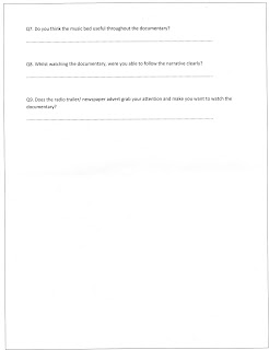
07: Do you think the music bed is useful throughout the documentary?

Some people like the way the lyrics doesn't distract the audience,the music made it more interesting, It suits the documentary and Its fun and creative.

Q8:Whilst watching the documentary, were you able to follow the narrative clearly?

Everyone said they were able to follow the narrative clearly and some people commented on the voice over saying it help stick the narrative/documentary together.

This was was of my favourite comments a
s bring able to follow the narrative clearly is an important thing so we have done that job well.

Q9: Does the radio trailer/ newspaper advert grab your attention and make you want to watch the full documentary?

some of the comments where: They both make people interested in the topic. Advert is eye catching and the trailer is informative. The advert looks real and professional. The radio is more interesting than the advert.


overall:
Overall the audience we showed it to in class thought it was entertaining and informative. Also by there comments such as: I would of liked to of seen a tattoo being done, this shows that the first 5 minutes of our documentary made them interested in the subject and probably would of made them watch the rest.


I uploaded our documentary to Facebook on the 13th December. Facebook is regularly used by people of all ages and is a way of showing the documentary easily. I got 13 comments from Facebook, some helpful and with good feedback, whilst others were not serious comment just a friendly well done and they like it.


As it was on Facebook it was easy to share, this is my mum copying it to her Facebook page so all her friends could watch and comment. Unfortunately no comments came about from this, but it shows how passing it on through friends could get a wider audience.


I also posted our print advert on Facebook, this didn't get many comments but the ones we got where helpful.


Such as "the channel 4 logo is a bit squashed" which would be something to improve on if it was to be done again.


And other comments "unusual and eye catching" which is what we were going for with the advert, so made me feel like we achieved what we were going for.


These are of me asking friends and family to watch them and comment on them. I thought if i was to ask them they would more likely to do it rather than ignore it when they see it on the Facebook page. This seemed a success as half the people who commented I asked, and the other half just commented after they noticed it.


Our group also posted it on Youtube to try and reach a wider audience outside our family and friends. The documentary got 133 views but only 2 comments. One comment was off a family member and the other was off a stranger. Although it was only one comment off someone who doesn't know me, it means that they will more likely to give an honest answer,which I felt they did.


Monday 13 December 2010

Evaluation question 4

How did you use new media technologies in the construction and research, planing and evaluation stages?

Sunday 12 December 2010

Making the Newspaper advert


This is me taking photo's for our newspaper advert. I took photo's of friends in school and family at home that have tattoos. This is one of me taking one of my step dads tattoo.


For out newspaper advert we planned to have
a person, one side covered in tattoos and one with a t-shirt on. This meant taking two photos and merging them, as well as taking photos to superimpose on to his body. I decided not to use this photograph as his mouth is open and I had no photos with his t-shirt on with his mouth open so wouldn't of gone together very well.


I chose not to use this photograph as he has a superman t-shirt on, and as this is such an iconic logo, I thought it might distract attention away from the tattoos and meaning of the newspaper advert.


I got the model to change his t-shirt so still a bright one but not one that would divert attention from the other side of the body which was the main side. We used this photo in the newspaper advert.


This was also used in the newspaper advert as the side we would cover in tattoos.


All the pictures below were used in the Newspaper advert:


This is a friend's tattoo she had done recently, this like most of them was copied and used twice on the advert.


This tattoo was used twice, once in full and once split up and used in different places.


This is the photo I was taking in the picture at the top, Its my step-dads tattoo, this was the biggest tattoo on the advert.


I cut this tattoo out using the magic eraser tool. It cut big sections out at a time so was quite easy.


Another of my step-dads tattoos.


As the model I used for the print advert had quite dark skin,but the person it was cut of had quite light skin, I had to change the levels to make it darker, so it looked right.


This tattoo was also used twice on the advert and was quite hard to cut out and took the most time,as its quite detailed.


With this I also used the magic eraser, so it made it very quite to cut out. The magic eraser didn't work on all of them because the lines wasn't clear enough, but as this was a close up picture it worked well.


We didn't end up using this picture on the print advert in the end. It didn't quite look right on his body, so we decided to put them on his actual lips. This meant cutting them in half, as we only wanted the one half of his body tattooed, and flipping it so we didn't get the skull side. We asked a few people if they liked it but couldn't tell they were lips, so we decided to take them off.


This picture was quite hard to cut out as the photo wasn't the best quality because it wasn't focused.


This tattoo I used twice on the print advert. One quite big one and one smaller one.


I started by cutting this tattoo out but found it quite hard to go around all the curves perfectly.


so I started again but this time using the magic lasso tool, which meant the curves were but out well after going all the way around the edge.


My friends tattoo of stars were the most used of all, they were a nice shape just to fill a shape.


To copy the stars, and the other tattoos I just pressed 'Ctrl and J' and that copied the layer so i could have multiple stars.


The first stage of putting the print advert together was the main two photos. This was done by cutting each photo in half and being placed next to each other, with it matched up exactly.


The next thing I did was to put the font on. That said the slogan and underneath the title, date, time and channel our documentary will be shown on.

Also shown on this picture is me drawing boxes to go as a background to the text.


This is with the boxes around the text, which needed arranging to put the text to the front layer.


This is the advert with the tattoos superimposed on.
Also with the channel 4 logo on, which needed a quick cutting out with he magic rubber tool.


After looking at it as a group, we decided to change the colour of the channel 4 logo to white, to match the other text, and so it stood out a lot more on the dark background.